Hi Clipido!
Use this page as the main guideline for everything related to branding and marketing materials. It serves as a central reference for all design work, ensuring consistency across channels and touchpoints.
Use this page as the main guideline for everything related to branding and marketing materials. It serves as a central reference for all design work, ensuring consistency across channels and touchpoints.


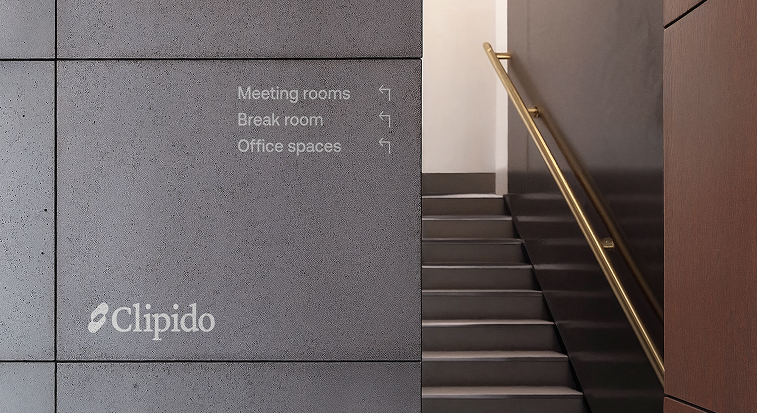
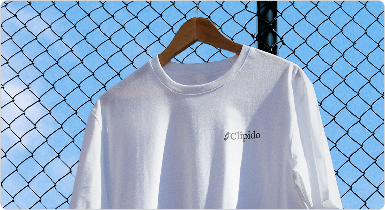
This is the primary Clipido logo and should be used wherever possible. The brand mark (without the wordmark), explained in the next section, can also be used to maintain brand consistency, but it does not explicitly communicate the name “Clipido.”
Always ensure there is enough white space around the logo to maintain clarity. The wordmark should never be used on its own and must always be accompanied by the icon.
The logo is available in SVG PNG and EPS formats.It is provided in multiple sizes and colour variations. Get in touch if you need additional files or adaptations.
Always ensure there is enough white space around the logo to maintain clarity. The wordmark should never be used on its own and must always be accompanied by the icon.

This is the primary Clipido logo and should be used wherever possible. The brand mark (without the wordmark), explained in the next section, can also be used to maintain brand consistency, but it does not explicitly communicate the name “Clipido.”
Always ensure there is enough white space around the logo to maintain clarity. The wordmark should never be used on its own and must always be accompanied by the icon.
The logo is available in SVG PNG and EPS formats. It is provided in multiple sizes and colour variations.Get in touch if you need additional files or adaptations.
Always ensure there is enough white space around the logo to maintain clarity. The wordmark should never be used on its own and must always be accompanied by the icon.

Purple is the primary brand color and is supported by the red. This combination is inspired by the marker colors commonly used on whiteboards, creating a subtle link to marcom teams. The contrast between purple and orange red adds energy and clarity while reinforcing the brand’s professional yet creative character.
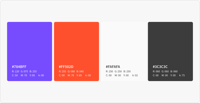
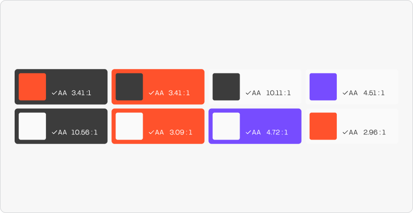
Please only use these color combinations to ensure the brand remains accessible and consistent.
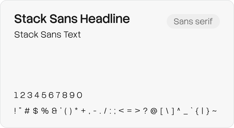
Stack Sans is a modern, geometric sans serif. It works equally well for headlines and body text and pairs well with our serif font. Stack Sans is a free, open source typeface available via Google Fonts.
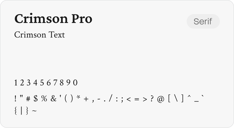
Crimson is a refined serif font, with elegant proportions and high readability. It adds a premium feel to text and highlights and pairs naturally with our sans serif. Crimson Pro is a free, open source typeface available via Google Fonts.
Lucide Icons is a modern outline icon set with consistent linework designed for clarity and very easy to use. Its clean minimal style complements our typography and layout, adding visual meaning without distraction. Lucide Icons is free.
The swooshes are used to highlight text or visual elements in a creative way. We use the Slasher brush, which is built into Figma, to achieve a marker style that sits between a rough brush and a regular line. This style is applied both to the swooshes and to the facial expressions. The facial expressions are a playful way to add a human and expressive touch. They are directly linked to the person, for example on business cards, or used to help clarify a feeling or message.
We combine typography with swooshes to highlight key words or phrases, using the marker style described above. This should be applied sparingly, ensuring text remains clear and legible and the overall look stays balanced and refined. Only interrupt text with an icon when it supports readability and meaning, and never when it risks feeling decorative or childish.

The grids
We work with two types of grids, using rectangular and square shapes in the patterns. They start from a soft fade, allowing them to blend into the background. The grids reference the product itself, where media is neatly placed within a structured system, while results appear to break free from the grid. The grids can be used flexibly as backgrounds, outline shapes, or containers. When no imagery is present, they can stand on their own with text placed on top, as shown in the example above.

Lorem ipsum dolor sit amet, consectetur adipiscing elit, sed do eiusmod tempor incididunt ut labore et dolore magna aliqua. Ut enim ad minim veniam, quis nostrud exercitation ullamco laboris nisi ut aliquip ex ea commodo consequat. Duis aute irure dolor in reprehenderit in voluptate velit esse cillum dolore eu fugiat nulla pariatur.