Hi Clipido!
Use this page as the main guideline for everything related to branding and marketing materials. It serves as a central reference for all design work, ensuring consistency across channels and touchpoints.

Use this page as the main guideline for everything related to branding and marketing materials. It serves as a central reference for all design work, ensuring consistency across channels and touchpoints.


This is the primary Commuty logo and should be used wherever possible. The brand mark (without the wordmark), explained in the next section, can also be used to maintain brand consistency across assets, but it does not explicitly communicate the name “Commuty”.
The logo consists of three shapes becoming one unified shape, each representing one of Commuty's core pillars: Parking, Charging & Commuting. The negative space between these shapes forms three arrows, creating a subtle reference to Commuty.
The logo is available in SVG PNG and EPS formats. It is provided in multiple sizes and colour variations. Get in touch if you need additional files or adaptations.
Always ensure there is enough white space around the logo to maintain clarity. The wordmark should never be used on its own and must always be accompanied by the icon.
This is the primary Commuty logo and should be used wherever possible. The brand mark (without the wordmark), explained in the next section, can also be used to maintain brand consistency across assets, but it does not explicitly communicate the name “Commuty”.
The logo consists of three shapes becoming one unified shape, each representing one of Commuty's core pillars: Parking, Charging & Commuting. The negative space between these shapes forms three arrows, creating a subtle reference to Commuty.
The logo is available in SVG PNG and EPS formats. It is provided in multiple sizes and colour variations.Get in touch if you need additional files or adaptations.
Always ensure there is enough white space around the logo to maintain clarity. The wordmark should never be used on its own and must always be accompanied by the icon.
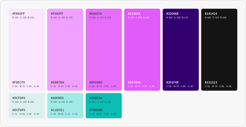
Please only use these color combinations to ensure the brand remains accessible and consistent.

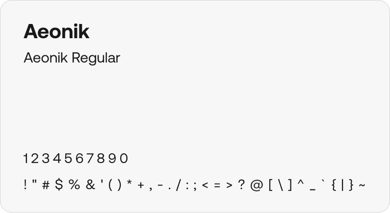
Aeonik is a neo-grotesque typeface. Available in eight weights it performs flawlessly across headlines and body text. With support for 340+ languages and comprehensive OpenType features, Aeonik is built for cohesive, global brand expression.

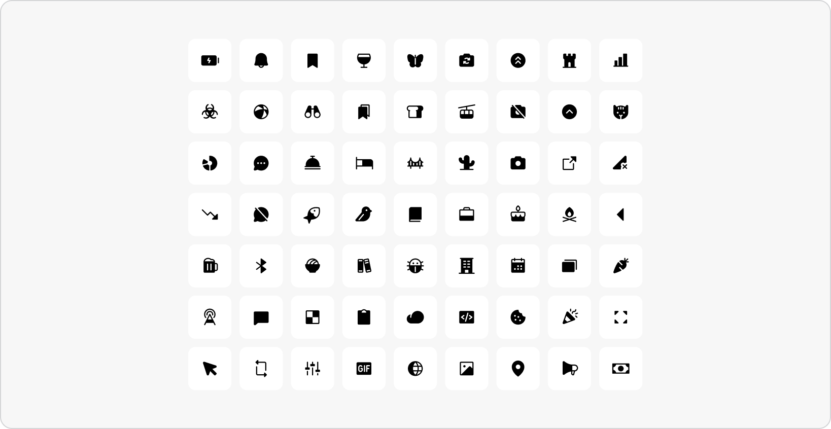
Phosphor Icons (fill) is a modern, filled icon set with consistent weight designed for clarity and ease of use. Its confident, solid style complements our typography and layout, bringing visual consistency across the full brand. Phosphor is free.
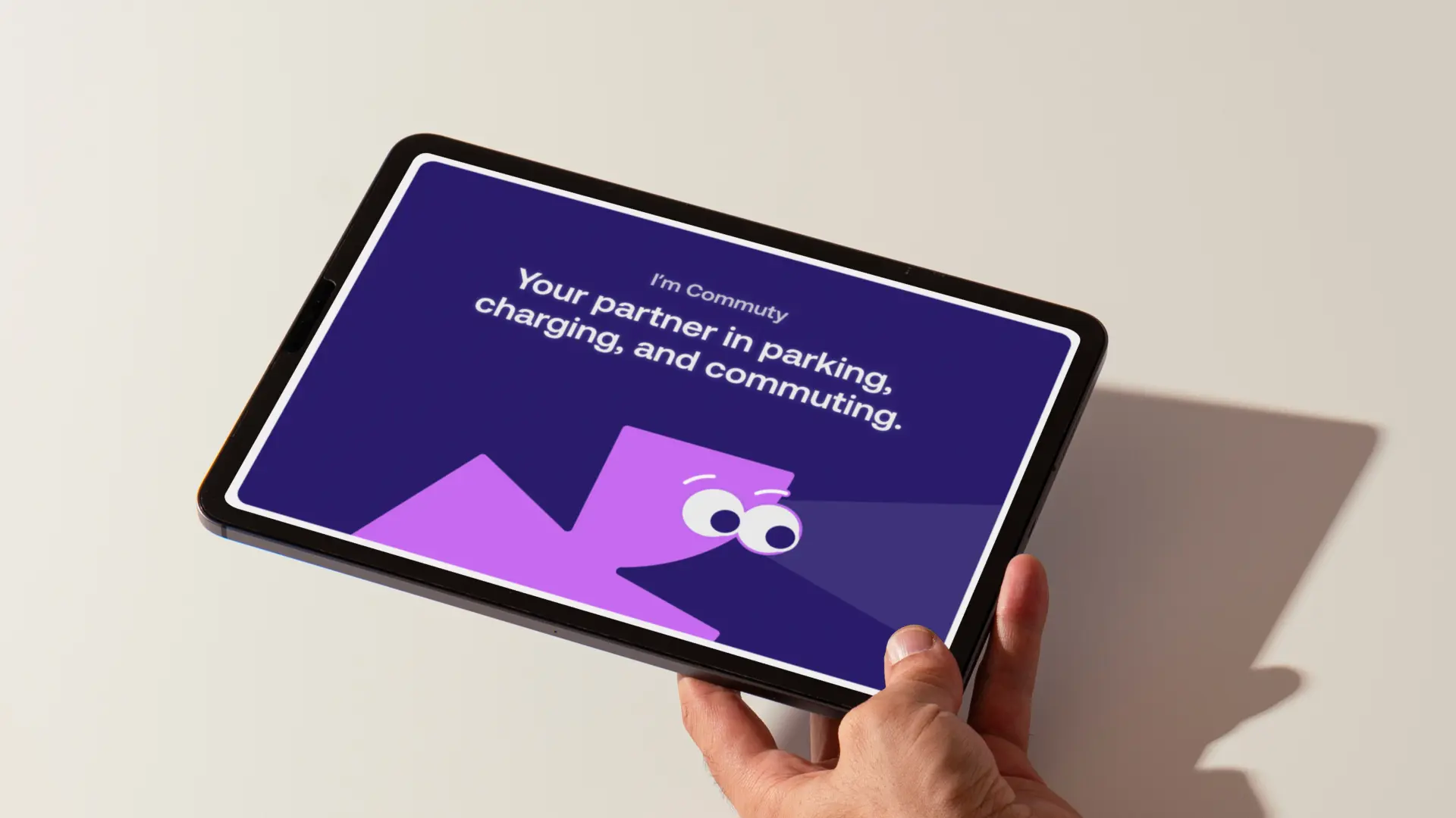
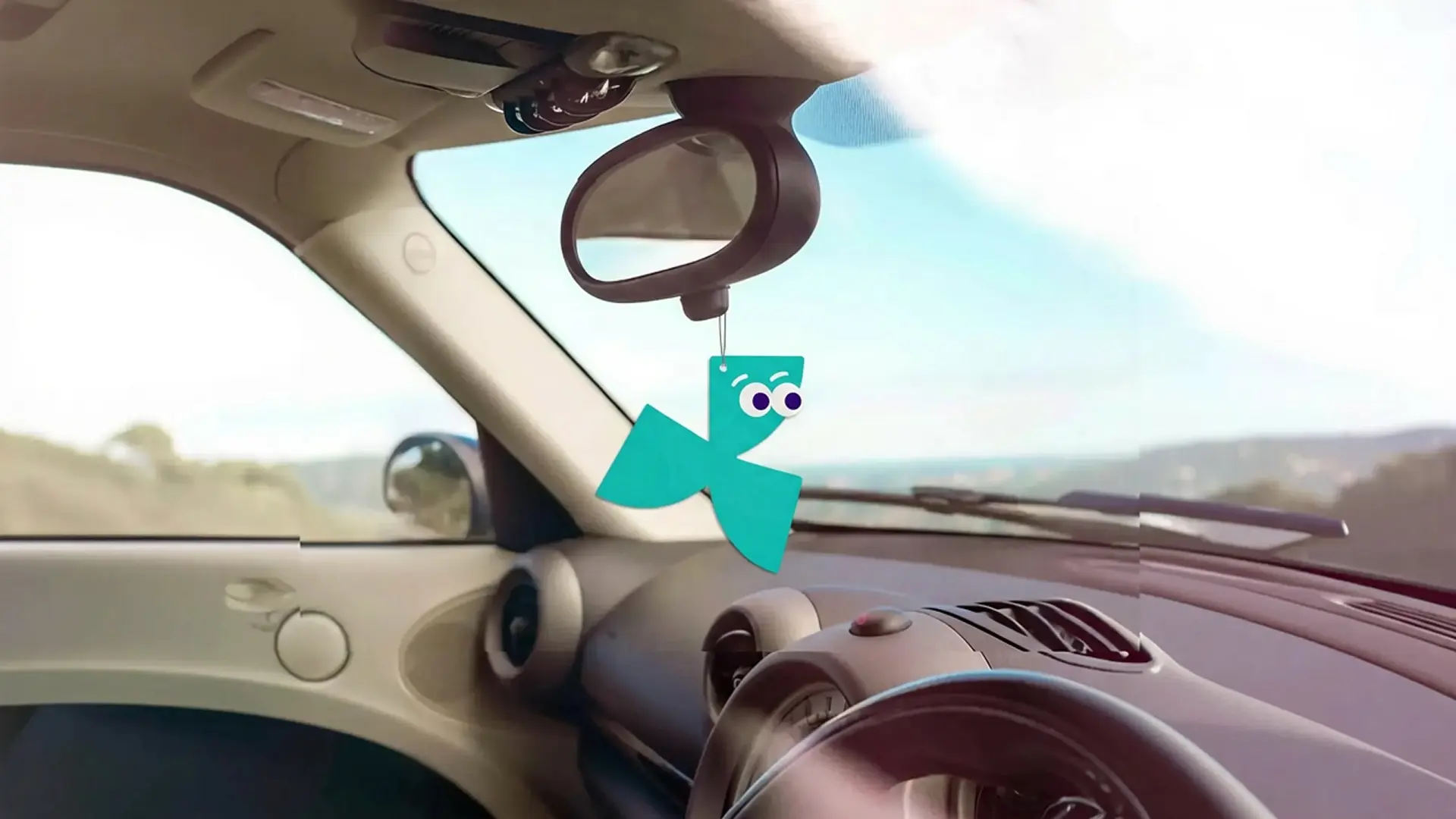
The character is a running figure with an eye that guides the way, like a moving light in the dark. Intentionally anonymous to not become too playful, the character has no formal name, though it answers to Commuty. It embodies the brand's core message and positioning, functioning as an active technical partner.
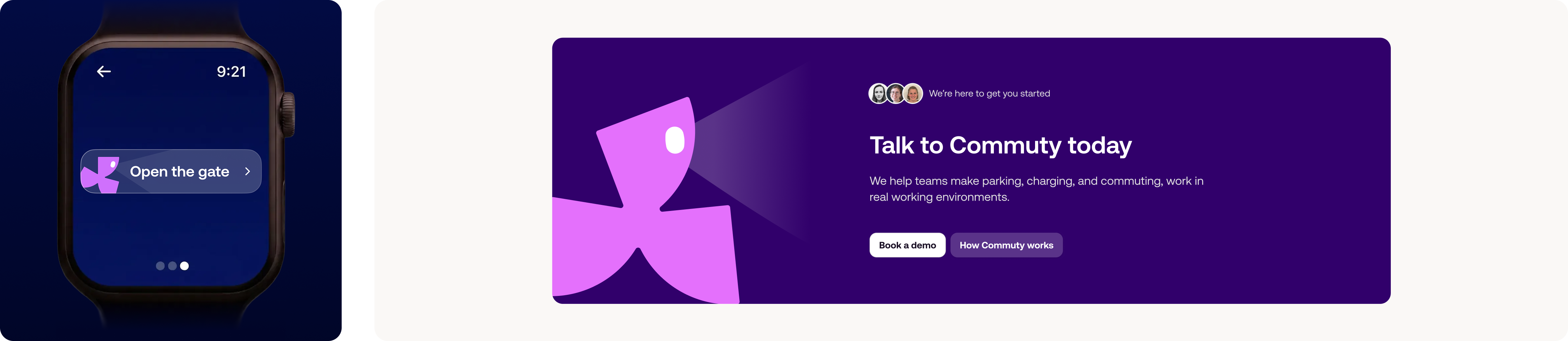
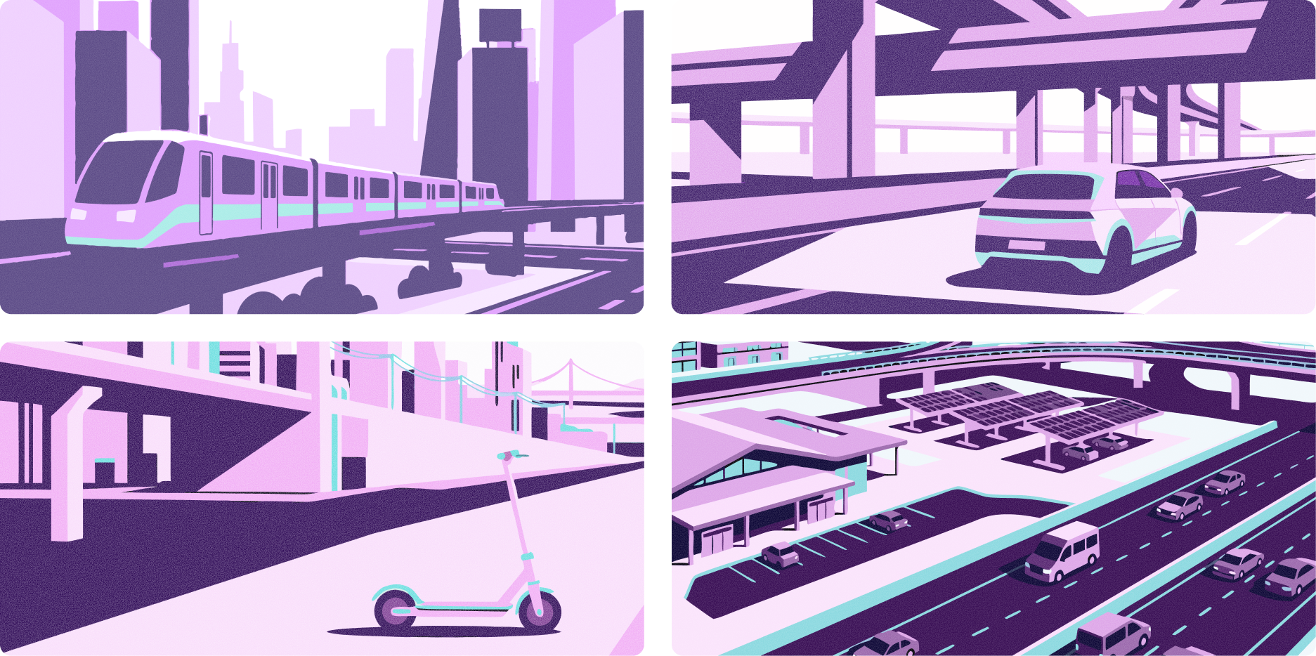
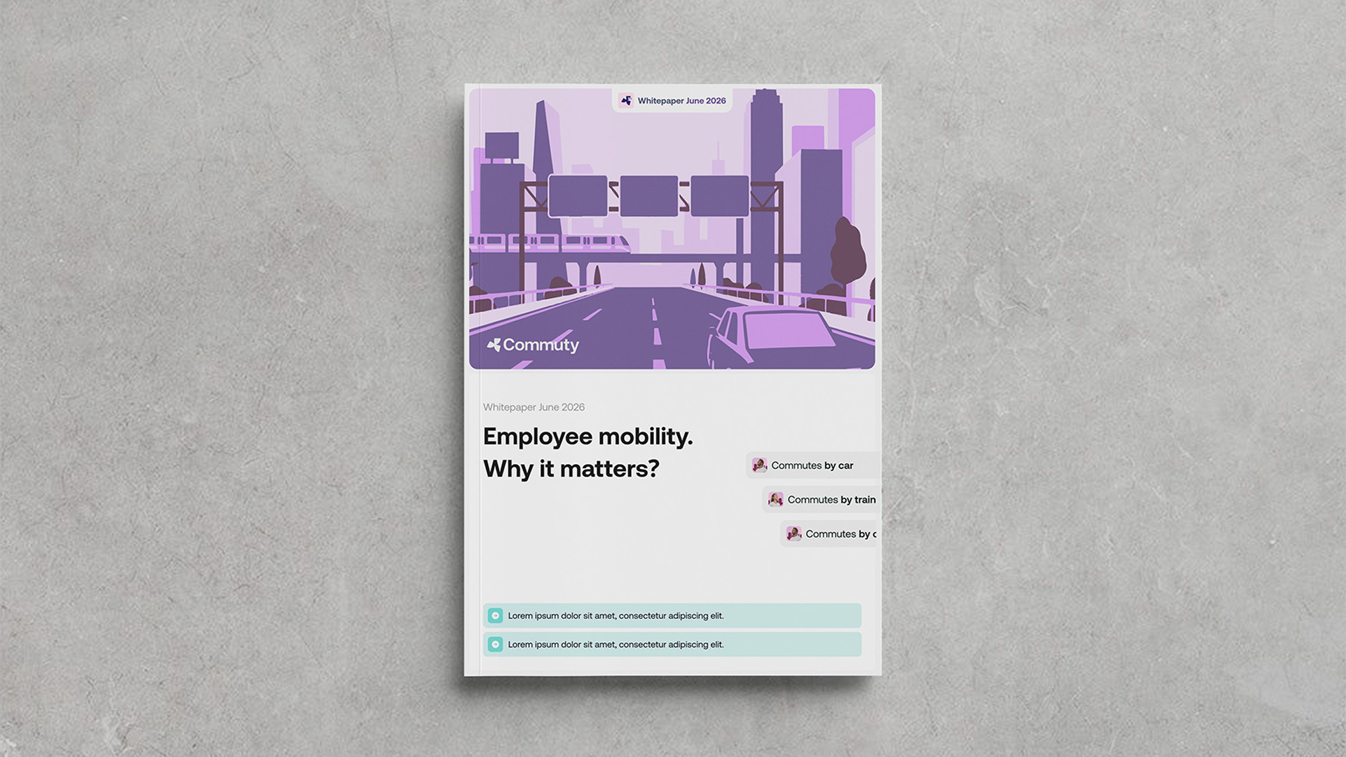
For Commuty, the technical partner, we created a habitat rooted in real commuting spaces: landscapes, parking lots, public transport, the everyday environments where mobility shapes the day. It doesn't give a holiday feeling or offer an escape to the current world, but an optimistic lens on daily movement: seeing the commute through rose-colored glasses. These landscapes can be created via Gemini. Never display humans on the illustration.