Hi Falcon!
Use this page as the main guideline for everything related to branding and marketing materials. It serves as a central reference for all design work, ensuring consistency across channels and touchpoints.

Use this page as the main guideline for everything related to branding and marketing materials. It serves as a central reference for all design work, ensuring consistency across channels and touchpoints.


This is the primary Falcon logo and should be used wherever possible. The brand mark (without the wordmark) can also be used to maintain brand consistency across assets, but it does not explicitly communicate the name "Falcon". The mark is built as a single continuous shape that reads as both the letter F and a falcon's wing mid-dive.
The logo is available in SVG PNG and EPS formats. It is provided in multiple sizes and colour variations. Get in touch if you need additional files or adaptations.
Always ensure there is enough white space around the logo to maintain clarity. The wordmark should never be used on its own and must always be accompanied by the icon.
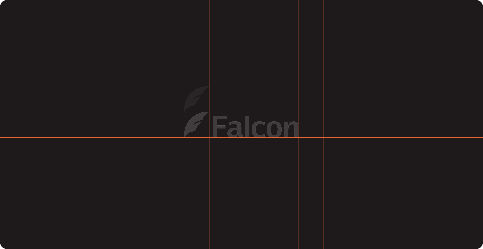
This is the primary Falcon logo and should be used wherever possible. The brand mark (without the wordmark) can also be used to maintain brand consistency across assets, but it does not explicitly communicate the name "Falcon". The mark is built as a single continuous shape that reads as both the letter F and a falcon's wing mid-dive.
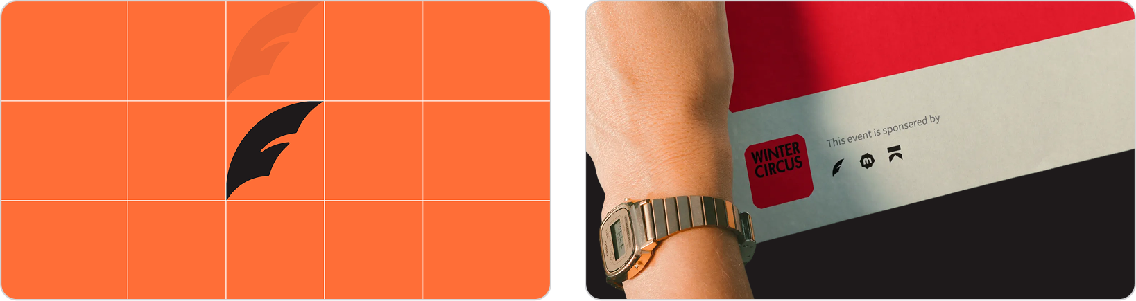
Always ensure there is enough white space around the brand mark to maintain clarity.
Falcon's palette leads with a high-energy orange that cuts against the navy-and-grey of traditional legal branding, paired with a softer lavender and pink to keep the brand approachable rather than aggressive. An off-white neutral rounds out the set, giving the palette a warm base instead of a stark white. Together they carry the brand's core tension: fast and precise, but human, not cold.
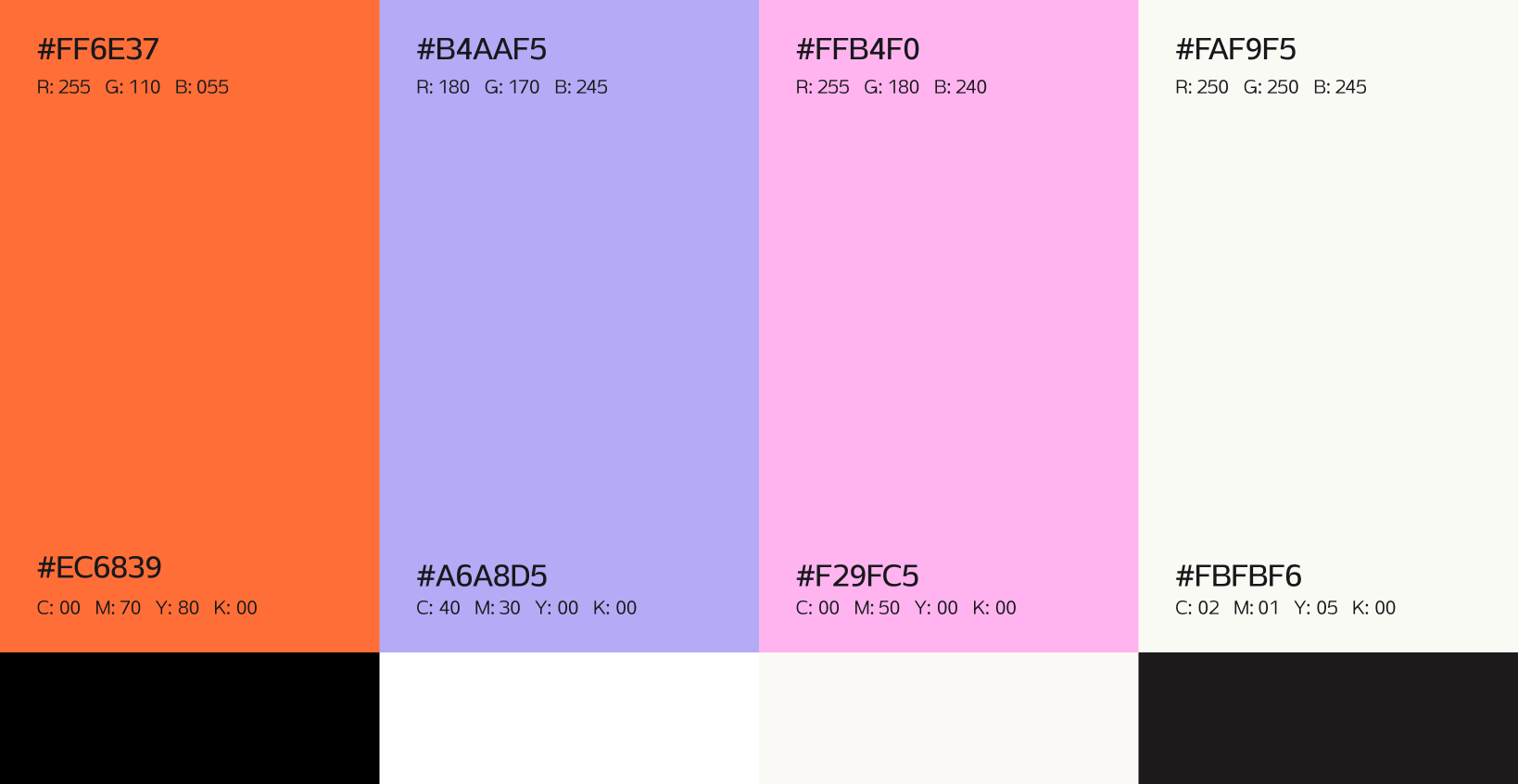
Please only use these color combinations to ensure the brand remains accessible and consistent.

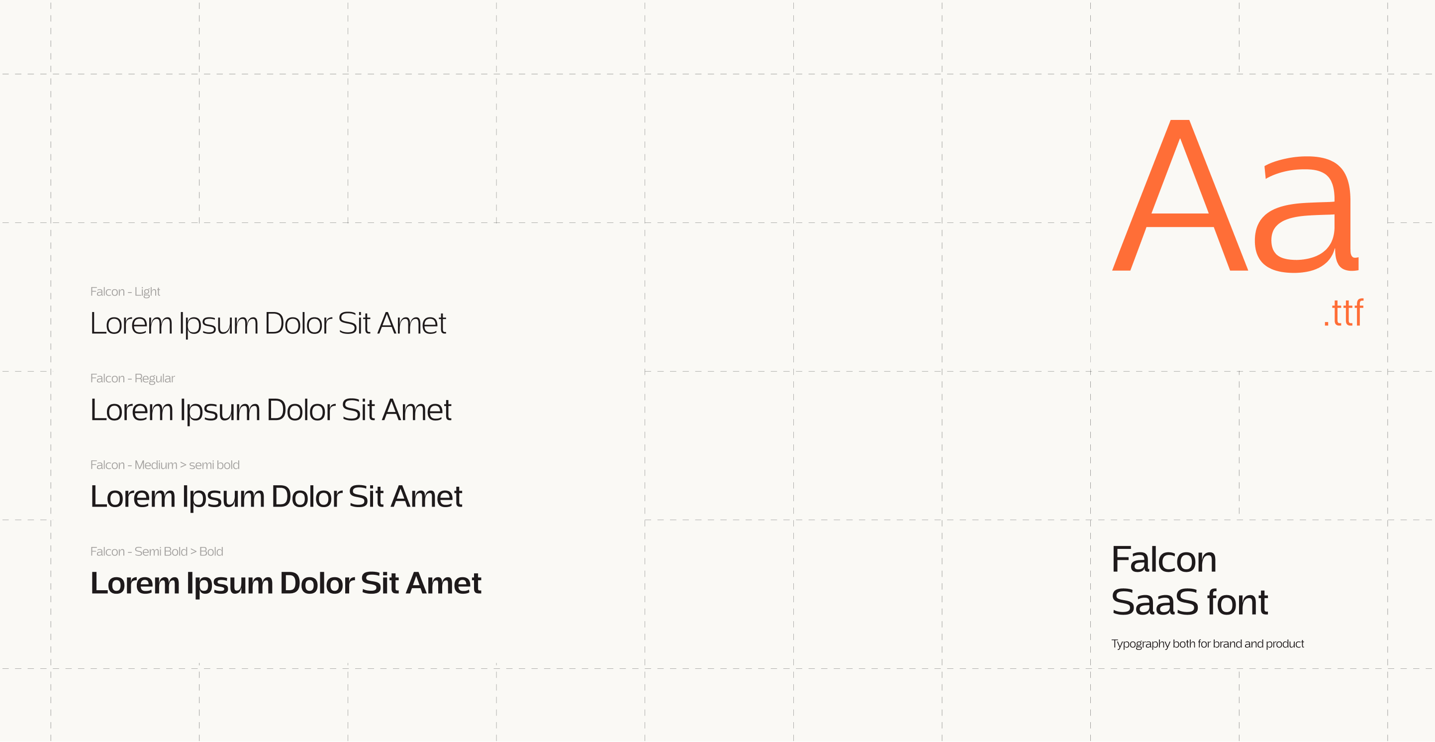
Falcon is a custom created font, cut with sharp, angular edges that echo the falcon's dive. It's built for marketing titles and headlines, not body copy.
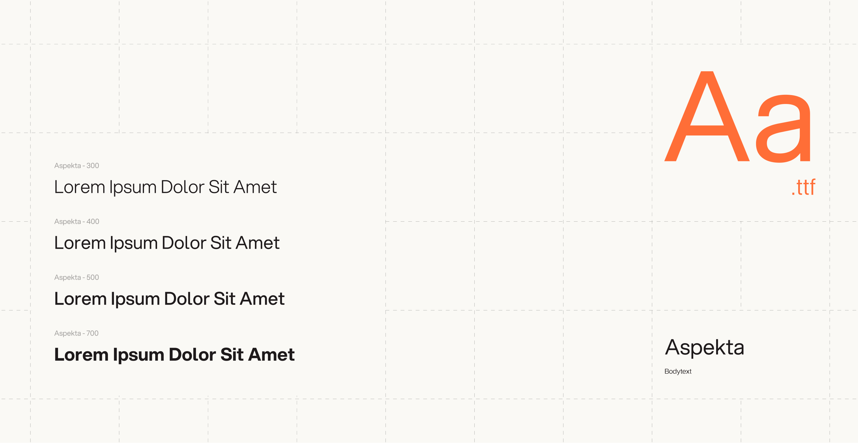
For body text, Falcon pairs with Aspekta, a variable sans that carries long-form reading without competing with the primary font's sharper character.
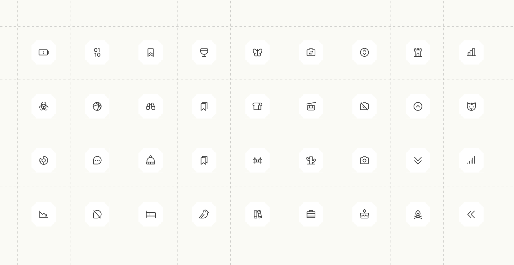
Lucide is a clean, stroke-based icon set with consistent line weight, built for clarity at small sizes. Its minimal, outlined style keeps interface elements precise rather than heavy
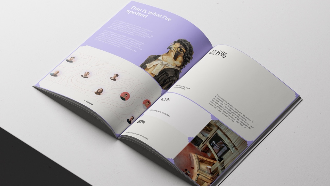
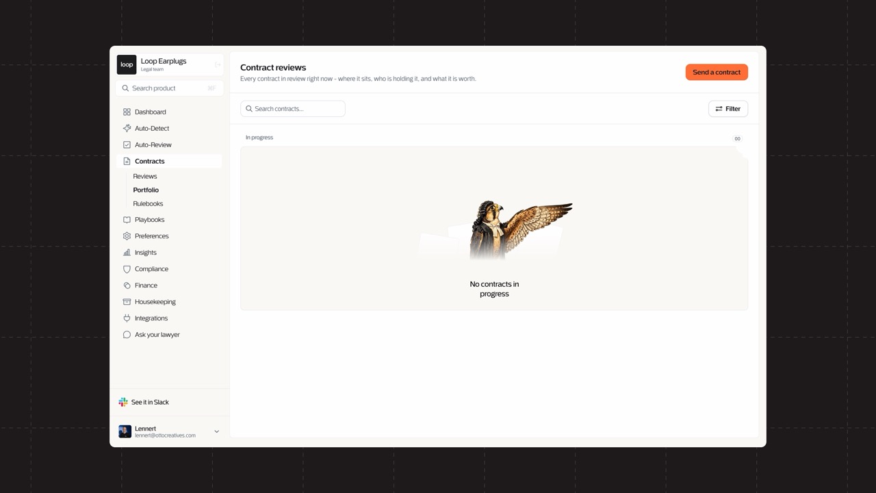
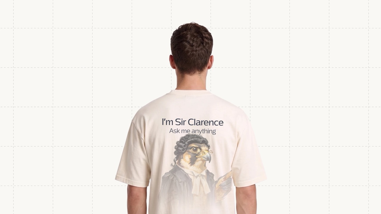
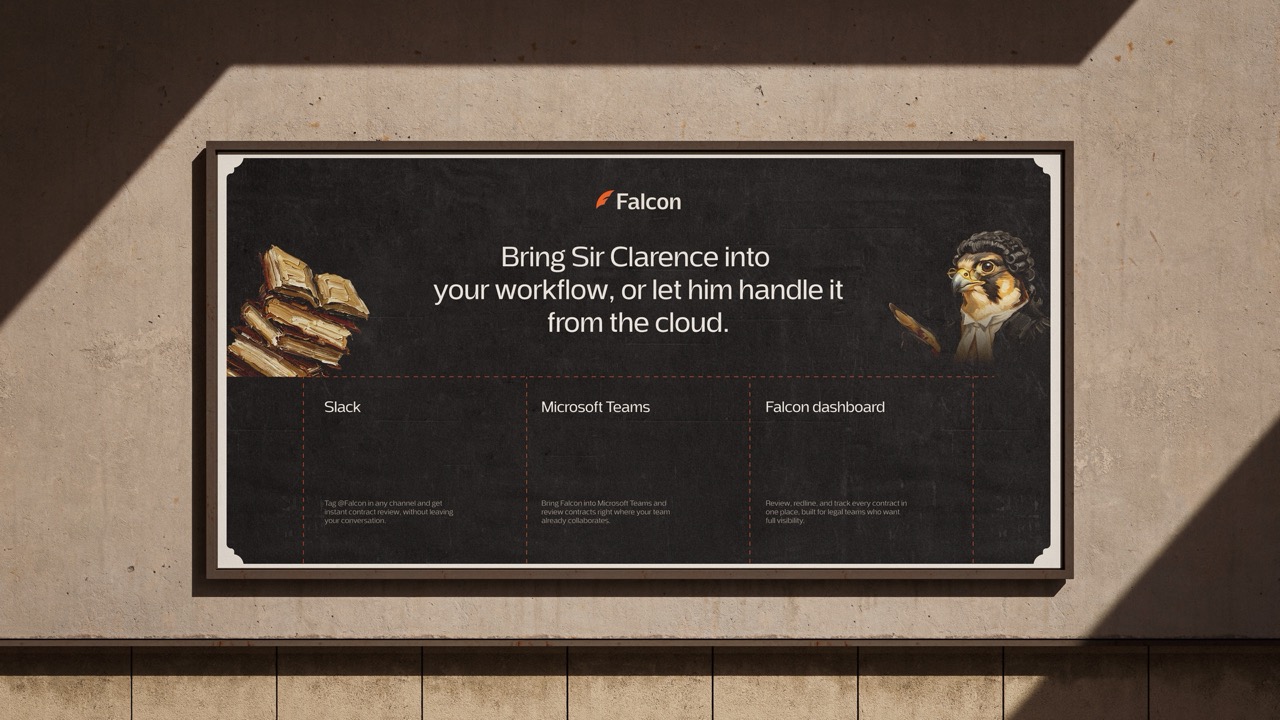
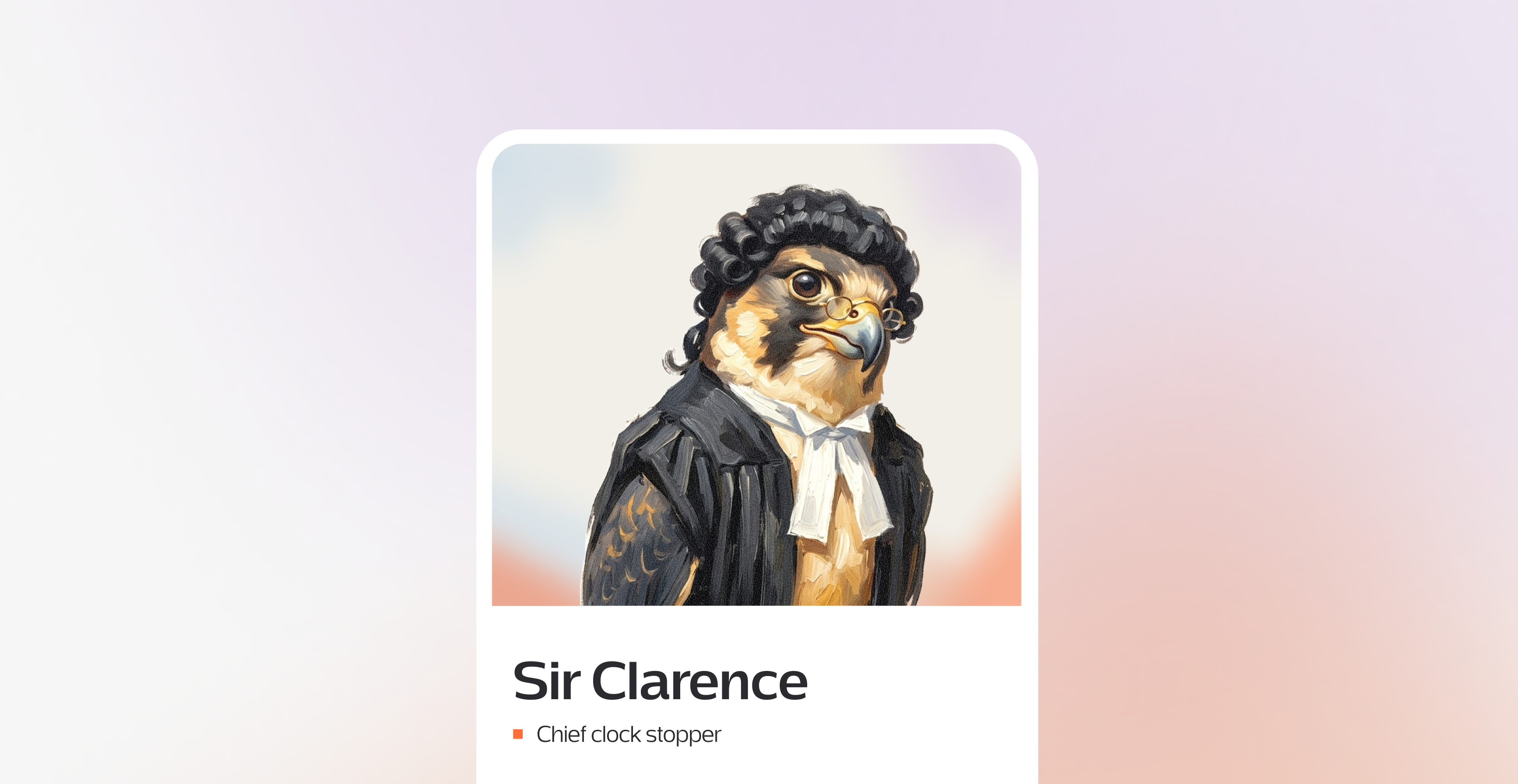
Every challenger brand needs a face. Revolut has its neon card, Alan its marmot, PostHog its hedgehog. Falcon has Sir Clarence: a character pulled from a Renaissance painting, giving the brand a presence that fights against the Harveys of this world. He looks serious at first glance, but a barrister's suit and judge-like touches give him a playful edge that keeps him from feeling stiff.
Falcon sees the whole terrain: every clause, every risk. That's the concept behind both background systems. We decided to go for two types of backgrounds, so it wouldnt become to limited.