

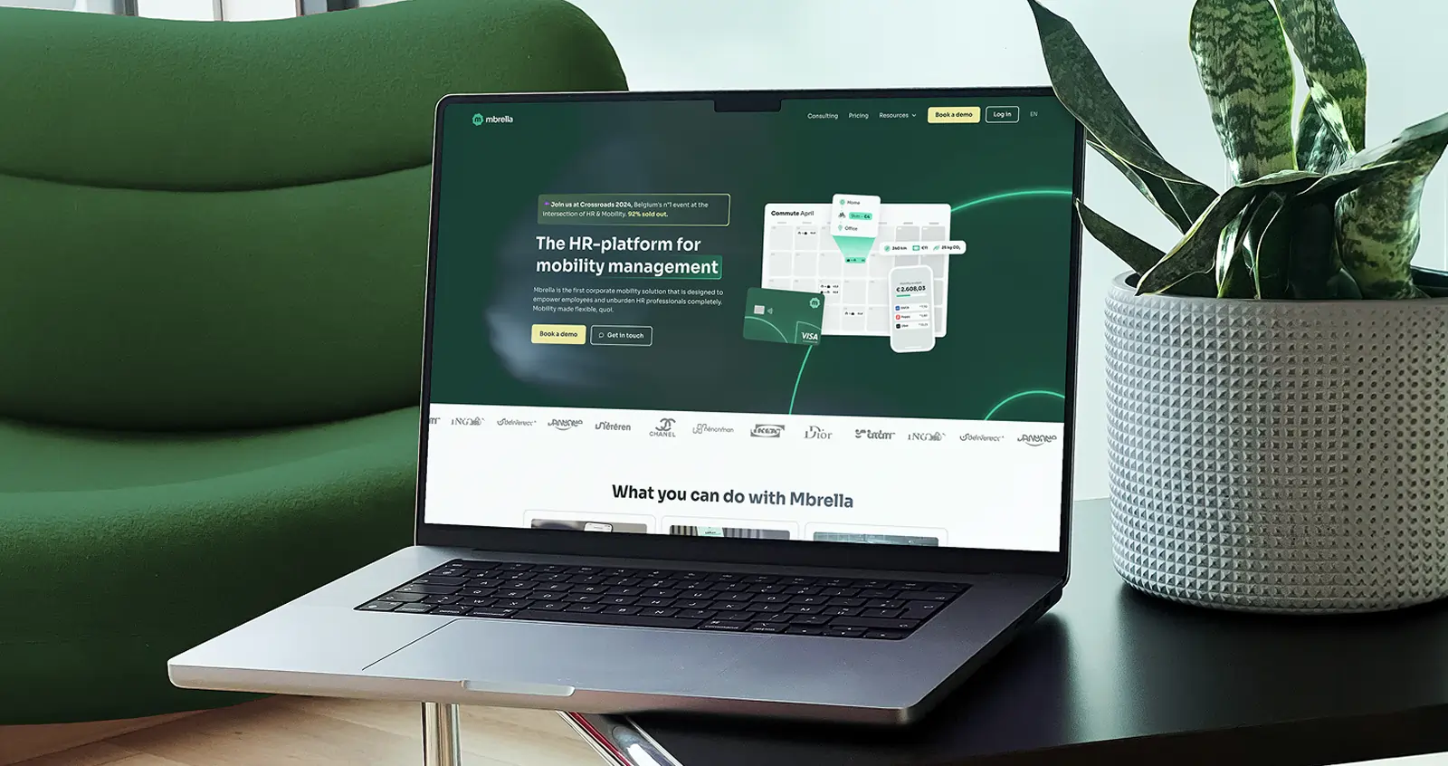
Rebranding for the future
As Mbrella scaled rapidly, they saw an opportunity to strengthen their brand and better connect with a diverse customer base. We partnered to create a visual identity that reflects their momentum and maturity, resulting in a confident, flexible system ready to grow with them.
2024
Rebranding for the future
Context
A growing brand, ready for what’s next
With strong traction in the market, Mbrella’s team recognized that their brand needed to evolve. Their rapid growth highlighted the need for an identity that could keep pace, one that felt as forward-thinking and reliable as the product behind it

Clear messaging for diverse audiences
Mbrella needed to speak to both agile startups and established corporates, each with very different expectations. The challenge was to create a brand that stood out in a crowded SaaS space while remaining credible, accessible, and professional across contexts.
.webp)
Align identity with ambition
Our goal was to design a brand system that felt distinct and confident, supported internal consistency, and made it easier for the Mbrella team to express who they are, no matter the channel, team, or target audience.
.webp)
.webp)
.webp)
Approach
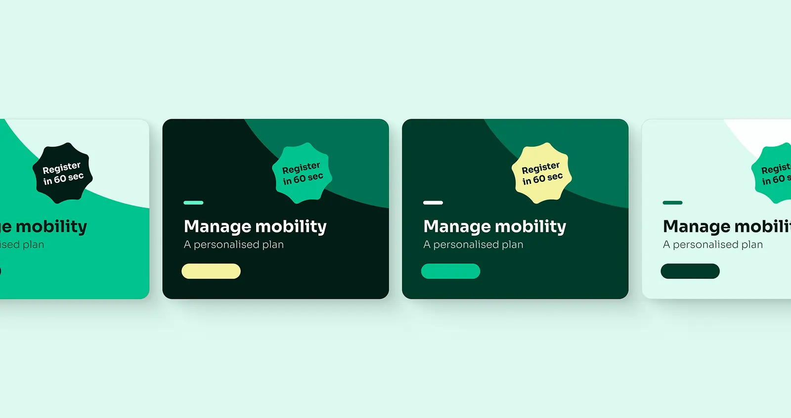
A visual identity built to stand out
The new Mbrella logo is a cornerstone of this rebrand, featuring two distinctive shapes that symbolize the integration of versatility and innovation. The angled umbrella, reminiscent of a turning wheel, represents mobility and forward momentum, key attributes in the mobility management space. This unique and recognizable logomark is designed not only to catch the eye but also to make a lasting impression.
.webp)
.webp)
.webp)
Cohesion and versatility in design
We built a visual system that goes beyond colors and fonts, using logo elements to create distinctive, reusable compositions. It brings consistency across all assets, boosts visual impact, and simplifies design workflows. See how it works in our Brand Identity bundle.
Outcome
We created a complete visual identity that reflects their momentum and maturity.
Checkout our related bundles
(Re)branding
Whether you're rebranding or starting fresh, this bundle gives you the strategy and design to show up with clarity and consistency.


No bundle? No problem. Each service can be requested on its own.
Ready to take your SaaS product to new heights?
Schedule a free 30’ intro call and find out if we are the creative partner you are looking for.
